2023 State of Web Components
Recently, I wrote about how to build your first Web Component, as well as some history and explanation of the basic v1 Web Component specs. But much more has happened in the world of Web Components since v1 reached full support in 2020. And even more is planned for the future. Let’s take a look at a few notable examples of what has been built with the current standards, as well as survey some of the work going into new Web Component standards in 2023 and beyond.
Web Components in the Wild
With the shipping of v1 Web Components in all browsers, many companies have adopted and built non-trivial businesses on these new standards. Here are a few examples that I think are worth noting.
YouTube

One of the earliest adopters of Web Components, the YouTube experience has been built with this technology for years. Inspect the source and you’ll see all sorts of custom elements, from the ytd-video-preview to the iron-ally-announcer.
Photoshop

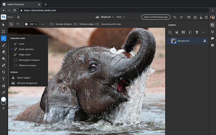
Yes, Adobe brought Photoshop to the browser using Lit. It’s in beta now, and you can try it for yourself if you’re an Adobe subscriber. There’s plenty of custom element goodness throughout, from the psw-app that forms the root of the application, to shell elements like the psw-layers-panel, to standard widgets like the sp-action-button.
MSN, Edge, Bing, VS Code, and More at Microsoft

A couple of years back, Microsoft re-built the MSN experience with the Fluent UI Web Components based on FAST. This improved performance by 30%–50% over the previous React version.
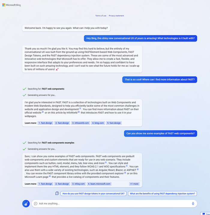
The new OpenAI-based Bing experience is also built with FAST Web Components, as seen in the screenshot below, recently shared by one of the developers.

Even the Webview UI Toolkit for Visual Studio Code, which the community uses to extend VS Code with new functionality, is built with FAST Web Components.

Approximately 1,500 teams and/or projects within Microsoft have adopted FAST Web Components in the last three years.
Salesforce

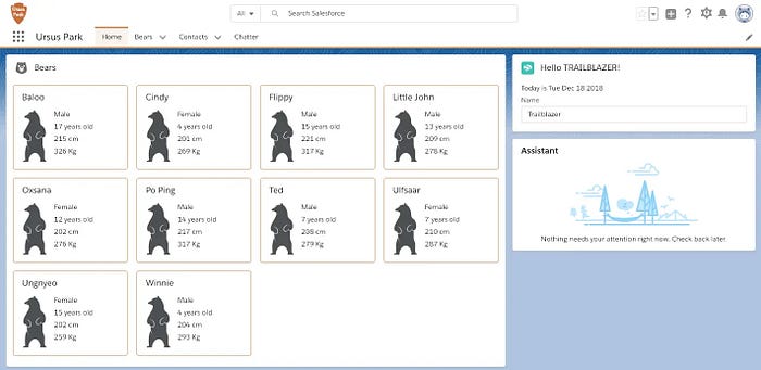
One of the industry’s biggest names in CRM, sales, and marketing automation platforms, Salesforce has been building on Lightning Web Components for years.
SpaceX

Web Components are now even in space. The SpaceX Crew displays are running Chromium, making extensive use of Web Components.
The Standards Landscape
Web Standards are ever evolving, and this includes Web Components. In the three years since v1 shipped to all major browsers, the number of features under the Web Components umbrella has nearly doubled. Here’s a diagram of the various shipped, in-progress, and planned Web Component-related standards.

Let’s take a look at each item in this diagram by traversing the six high-level categories I’ve broken the features down into: Composition & Scope, Platform Interop, Rendering & Performance, Styling, Package & Distribution, and API Paradigms.
Composition and Scope

Web Component scoping/encapsulation features are important for all the traditional reasons you may have learned about when studying general purpose programming: information hiding, maintenance, codebase scalability, etc. But when it comes to Web Components, they also provide the HTML and CSS runtimes with additional metadata that it can use to optimize paint and layout.
Shadow DOM
Shadow DOM is the basic mechanism in HTML by which DOM and associated styles can be scoped, encapsulated, and composed. It’s a multi-faceted feature with many capabilities that continue to expand.
- Named Slot Assignment (Fully Supported)— The original v1 Shadow DOM specification provided a fully declarative mechanism for using named
<slot>elements in the Shadow DOM to define element composition placeholders. A consumer of the component could simply place aslotattribute on any child element of the host element, and the browser would automatically “project” that element’s rendered output into the location of the slot. - Open and Closed Modes (Fully Supported) — The
modeoption of theattachShadow()API was part of the v1 Shadow DOM specification. It allows the component author to select their preferred encapsulation mode. Theopenmode enables theshadowRootto be accessed from outside the host, while theclosedmode denies access. - Event Re-target (Fully Supported) — When events fire from elements within a Shadow DOM, those events are “re-targeted” so that they appear to originate from the Shadow DOM host. This capability of the v1 Shadow DOM specification is an important part of encapsulating internal structures properly.
- Manual Slot Assignment (Fully Supported) — The new
assignAPI onslotelements extends the original slot assignment features of v1 by providing an imperative API in addition to the previous declarative-only slotting mechanism. - Focus Delegation (Fully Supported) — This post v1 feature enables a Shadow DOM to tell the browser that when its host element is focused, it should instead delegate focus to a particular element within the Shadow DOM. The first focusable element is selected by default, but this can be overridden using the
autofocusattribute. - Cross-root ARIA (Near Consensus) — An upcoming feature that has nearly reached consensus with the community and browser vendors, Cross-root ARIA will greatly simplify associating ARIA critical elements outside of a Shadow DOM with elements within a Shadow DOM. e.g. associating a
labelelement outside of a Shadow DOM with aninputelement inside of a Shadow DOM. These types of ARIA scenarios have solutions today, but they are not for the faint of heart. Cross-root ARIA will greatly improve this. - In Shadow CSS Property Definitions (Consensus) — Today, some browsers enable you to use
@propertysyntax in CSS to define CSS custom properties. However, this doesn’t work in a Shadow DOM yet. The CSS Object Model can always be used from custom element code to define these globally, but having this available in a declarative form from within Shadow DOM is a commonsense improvement. This has reached consensus, so hopefully we’ll see this soon as the browsers more generally support the new CSS syntax.
Scoped Element Registries (Consensus)
In the v1 specification of custom elements, all elements were registered in a global custom element registry via the customElements global. This new addition enables the ability to instantiate non-global registries and register custom elements with them.
const myRegistry = new CustomElementRegistry();
myRegistry.define("my-element", MyElement);
The elements in the registry are only defined for the Shadow DOM that the registry is then assigned too. This greatly improves scoping in the browser so that element definitions can be scoped per shadow root as desired. This will be huge when it ships to browsers, opening up new architectural possibilities. At present, consensus among the community and vendors has been reached and Chromium is working on the first implementation.
Platform Interop

One of the most important aspects of Web Components is how they enable interoperability between components and the platform. Let’s look at some current and future features in this area.
Custom Elements
- Autonomous Custom Elements (Fully Supported) — This core feature of Web Components v1 enables defining a custom element that inherits from
HTMLElementby registering a class with thecustomElementsglobal. Basic lifecycle callbacks and observed attributes are also part of the specification. - Customizable Built-in Custom Elements (Rejected) — Originally, there was a proposal to enable inheriting from built-in elements, such as
HTMLParagraphElement, but WebKit implementors discovered several technical problems, and so have rejected this spec. It’s likely to be removed in the future and should be avoided. See “Custom Attributes” below for a potentially better alternative.
Element Internals
A new post-v1 API, ElementInternals enables deeper platform-level integration of custom elements with existing DOM subsystems.
- Shadow Root Access (Fully Supported) — This simple addition enables the component author to retrieve the shadow root instance of a
closedmode element. Without this there would be no way for an element with aclosedmode Declarative Shadow DOM to access its root at runtime. - Form Associated Custom Elements (Fully Supported) — This major new set of features enables custom elements to fully participate in forms, including form validation, submission, and reset.
- Default Accessibility Roles, States and Properties (Mostly Supported) — This new set of APIs enables setting up the default accessibility characteristics of a custom element by directly communicating with the platform internally, rather than through external facing attributes on the host element that could be inadvertently removed by consumers. At this time, the new API is supported in every major browser except for Firefox, for which there is a polyfill. Since Firefox has already implemented the rest of the
ElementInternalsAPIs, I would be surprised if they didn’t ship this in the near future.
Composed Selection (Consensus/No Spec)
This improvement proposes a new getComposedRange() API for the Selection object, that enables the start and end of the range to cross over multiple shadow roots. It would also improve consistency with how browsers handle these scenarios today. There is general consensus on the strawman API proposal, but a full spec is still needed before browsers can move ahead with implementations. This isn’t something you are likely to bump into during the normal course of Web Component development. It primarily pertains to rich text editor implementations.
Custom Attributes (Identified)
While this feature isn’t necessarily part of Web Components, it has high overlap with the set of scenarios that Web Components are intended to serve. The strawman proposes to enable the creation of reusable behaviors that can be attached to any HTML element, following a similar pattern to Web Components. For example, imagine a Material Design ripple effect that you want to apply to any HTML element. Wouldn’t it be nice if you could just do something like this?
<button material-ripple>Click Me</button>In the strawman proposal I prepared for TPAC 2022, I show what the programming model for this could look like:
class MaterialRipple extends Attr {
  // ownerElement inherited from Attr
  // name inherited from Attr
  // value inherited from Attr
  // ...

  connectedCallback () {
    // called when the ownerElement is connected to the DOM
    // or when the attribute is added to an already connected owner
  }

  disconnectedCallback () {
    // called when the ownerElement is disconnected from the DOM
    // or when the attribute is removed from a connected owner
  }

  attributeChangedCallback() {
    // called when the value property of this attribute changes
  }
}

customAttributes.define("material-ripple", MaterialRipple);
You’ll notice that the pattern and lifecycle is the same as Web Components. This would also provide a better and more robust alternative to the is attribute that was part of the rejected Customizable Built-In Custom Elements proposal.
Rendering & Performance

Rendering and performance are critical to Web Components. While the basics are in place today, this remains an active area of exploration, debate, and future innovation.
HTML Template Element (Fully Supported)
The HTMLTemplateElement and its ability to define inert HTML content was a key part of the v1 Web Components features. Prior to this element, there was no way to declare HTML that wouldn’t be activated by the browser, making it hard to create components that needed to repeatedly render the same HTML on demand.
Declarative Shadow DOM (Mostly Supported)
The v1 specification of Shadow DOM only enabled creating shadow roots through the attachShadow() JavaScript API. This new enhancement to Shadow DOM allows fully declaring Shadow DOM content in HTML without the use of JavaScript, opening up interesting new possibilities for server frameworks.
<host-element>
  <template shadowrootmode="open">
    <slot></slot>
  </template>
  <h2>Light content</h2>>
</host-element>
This specification reuses the template element. Don’t be confused by that. It’s not a template. Its active DOM that is streamed into the shadow root by the HTML parser.
All browsers except for Firefox currently support Declarative Shadow DOM. This feature can be polyfilled with just a few lines of JavaScript code, if desired.
Children Changed Callback (Proposal)
Web Components have a well-defined lifecycle as laid out in the v1 specification for custom elements, but that doesn’t mean we can’t expand the lifecycle in the future. One of the common developer challenges is enabling a Web Component to respond to the addition or removal of child nodes. This can be accomplished today with slotchange events and MutationObserver but it would be nicer to have a lifecycle callback such as childrenChangedCallback() that could offer improved performance, simplification, and integration with the HTML parser itself. At present there is a strawman proposal and there appears to be interest from implementors. A full proposal is needed to move this forward to the next stage.
Template Instantiation
While HTML has templates, it doesn’t yet have a mechanism for instancing templates that are connected to data and updating them when their dependent data changes. This area of “template instantiation” has several pieces that are each independently valuable.
- DOM Parts (Proposal) — This proposal would provide a standard mechanism to insert or replace content at specific locations within the DOM tree. You can think of this as a low-level enabler to aid in creating more efficient templating engines and batched updates in existing Web Component libraries and JavaScript frameworks. It doesn’t provide a solution for reactivity or a templating syntax, but just the low-level standard infrastructure for locating and updating parts of the DOM.
- Template Syntax (Identified) — Once the low-level infrastructure for targeting and batching updates is in place and being successfully used by existing libraries, then the great debate over syntax can happen. Template syntax is a highly contentious issue, but it has been recognized that HTML should have a basic language for this, even if it only serves as a compilation target for other libraries.
- Reactivity (Identified) — DOM Parts provide the standard mechanism for batch updating the DOM. Template Syntax provides the declarative mechanism for creating DOM parts. What is left is a mechanism to determine when DOM Part updates should be executed. This is where reactivity comes in to complete the full picture. It’s another contentious issue but there is already some precedent for it via the Web Components
attributeChangedCallback(). Much more exploration is required on this topic.
The Template Instantiation category of work is broken down into the above three sub-features in order to enable less contentious issues to be solved earlier and to provide a path for existing libraries and frameworks to leverage the less opinionated, performance-improving capabilities with less friction for their communities.
Styling

While Shadow DOM provides the encapsulation for styles, there are a number of CSS features that directly relate to Web Components and are important day-to-day when working with them.
Consumption
Several current and future standards pertain to how styles are consumed by Web Components to create their presentation of the Shadow DOM. While it’s always been possible to create style elements in the Shadow DOM for this purpose, new standards offer improved ergonomics and performance benefits.
- Constructible Stylesheets (Fully Supported) — Did you know that prior to this standard you could not actually create a
CSSStyleSheetinstance? This standard fixes that so you can now write the codenew CSSStyleSheet(). This ability enables more dynamic creation and consumption of styles in Web Components, including sharing style sheets across components. - Adopted Stylesheets (Fully Supported) — Given a
CSSStyleSheetinstance, how does one associate it with a particular shadow root or the global document? This new standard adds anadoptedStyleSheetsarray to both thedocumentand all shadow root instances. Simply push the style sheet into that array, and you are good to go. - CSS Module Scripts (Chromium) — Constructible Stylesheets and Adopted Stylesheets on their own provide the raw mechanism for creating, sharing, and associating sheets with documents but this still forces the CSS itself to be created in JavaScript. The CSS Module Scripts standard enables using a JavaScript module import of a
.cssfile that results in the platform creation of aCSSStyleSheetinstance, with no need to cross back and forth between the native CSS runtime and the JavaScript runtime. - Declarative CSS Modules (Identified) — With the advent of Declarative Shadow DOM and Adopted Stylesheets, several strawman proposals have been created to enable declaring CSS modules and declaratively associating them with Declarative Shadow DOM. More exploration is needed in this area but it’s an exciting possibility for the future of HTML and CSS.
Presentation
Primarily, CSS focuses on presentation concerns. There are a few standards that expand styling possibilities for Web Components.
- CSS Custom Properties (Fully Supported) — Not unique to Web Components, but an important aspect of creating systems of components, Custom CSS Properties are a v1 spec that enable the creation of native CSS variables that can be used across shadow roots.
- CSS Shadow Parts (Fully Supported) — CSS Parts allow declaring elements within your Shadow DOM as a “part” that can be styled with selectors from the outside. This is done with the
partattribute and theexportpartsattribute for nested scenarios. - CSS Custom States (Chromium) — Native elements can have custom states, usable in CSS selectors. An example of this is checkbox’s “checked” and “unchecked” states. This new feature would allow Web Components to define their own states. Consensus has been reached and Chromium has shipped the first implementation, accessible via
ElementInternals. This can be polyfilled while waiting for other browsers to catch up. - CSS Theming (Proposal) — While rich theming can be accomplished with careful use of CSS Custom Properties and CSS Shadow Parts there may be opportunities to simplify and improve this by explicitly introducing the concept of theming to CSS.
- Open Styling of Shadow Roots (Identified) — While it’s possible to use Constructible Stylesheets and Adopted Stylesheets to make any global CSS shareable within shadow roots, it may not be an intuitive process for the average web developer. There is some exploration around a mechanism for explicitly choosing to allow external CSS into certain shadow roots.
Package & Distribution

So far, we’ve been talking mostly about standards pertaining to the implementation of Web Components. But it’s just as important to consider how components are packaged and loaded.
Lazy Custom Element Definitions (Proposal)
Today, we have the ability to define components with the global customElements registry, and soon with custom registries. But, in both these cases, the implementation of the component must already be loaded before the component can be defined. With Lazy Custom Element Definitions, a developer would have the ability to tell the platform about an element, but delay loading it until “just in time” when the element first appears in the document. It might work something like this:
customElements.defineLazy(
  "my-element",
  async () => (await import("my-element.js")).default
);
This specification seems to be recognized by most as something that would be nice to have especially for certain architectures. However, details of the proposal are still being debated.
HTML Module Scripts (Identified)
HTML Modules is the HTML equivalent of CSS Module Scripts. With the HTML Modules proposal, templates (and other HTML artifacts) would be importable directly through the JS module system. Right now, there is only a strawman proposal, and many more details need working through, but this is recognized as an important long-term enhancement, especially when considering the future possibility of single-file HTML-only Web Components.
API Paradigms

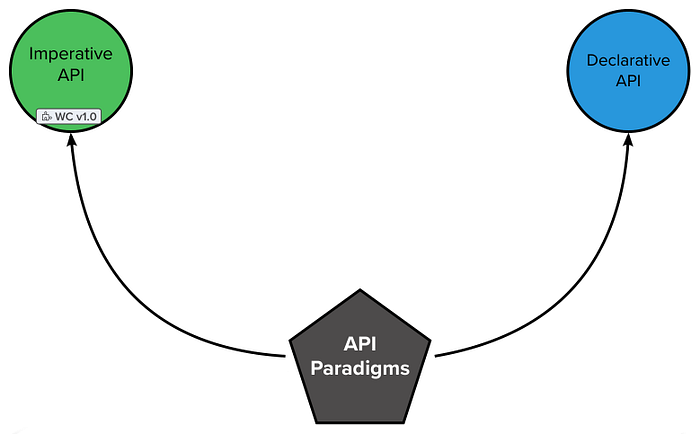
The final category of standards is a bit different than everything I have previously discussed here. These standards deal with the fundamental programming paradigm of Web Components. Web Components v1 was primarily an imperative JavaScript programming model. There were some notable exceptions, such as declarative slot assignment. But for the most part, it was entirely imperative in nature. Since v1, we’ve been working to introduce more and more declarative features. A big example of this is Declarative Shadow DOM. In general, it would be nice to have both declarative and imperative APIs for everything. But the big endgame here is eventually having some form of fully declaratively defined Web Component so that servers can send element definitions to the browser that can work 100% in a noscript context. We’re a way off from that, but when we get there, it’s going to fundamentally change both client and server development.
What’s Next?
Work on standards is always ongoing. In fact, starting today, the W3C Web Components Community Group is meeting for its Spring 2023 face-to-face event. Like TPAC, it’s an opportunity for library authors, component creators, browser vendors, etc. to get together and carve out dedicated time to work through the details of the specs that still need to gain consensus or that have open questions. I look forward to updating all of you in a follow-up blog post, covering the outcomes of the event. Please follow/subscribe to make sure you get the update 😄
Wrapping Up
I hope you’ve found this tour of Web Component standards enriching. It’s fun to see how far we’ve come and what’s in store for the future. With the v1 releases behind us, a doubling of shipped features in the last couple of years, and exciting new features on the horizon, it’s a good time to be a web developer.
If you enjoyed this look into Web Components, you might want to check out my Web Component Engineering course. I’d also love it if you would subscribe to this blog, subscribe to my YouTube channel, or follow me on twitter. Your support greatly helps me continue writing and bringing this kind of content to the broader community. Thank you!
